
Three Fins Coffee Re-brand
I was given a random coffee shop and had to re-brand it to give it more affordances that strengthen the company
This coffee company is Three Fins, a shop located in Cape Cod. They take coffee beans from every region and create their tasty coffee! When I saw their current logo, I got confused about what I was looking at. Were they shark fins in the water, or were they surfboards? I did more research on them and found out they are very big into helping out the environment. They want to improve the ocean, wildlife, and climate they live in.
Research about Three Fins
- They are located in Cape Cod, Stoughton, and Brookline.
- They have a variety of coffee beans from all over the world.
- They sell their own Eco-friendly bags and mugs.
They seemed to be more for tourists since they are mainly located on Cape Cod, so they tend to get a crowd from ages 20-30. They tend to also host events to push their brand more and help the environment.
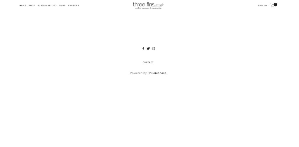
Their online presence is something that they need to work on. They have a clean website but have no events or even a calendar on it. Check out their website here https://www.threefinscoffee.com/
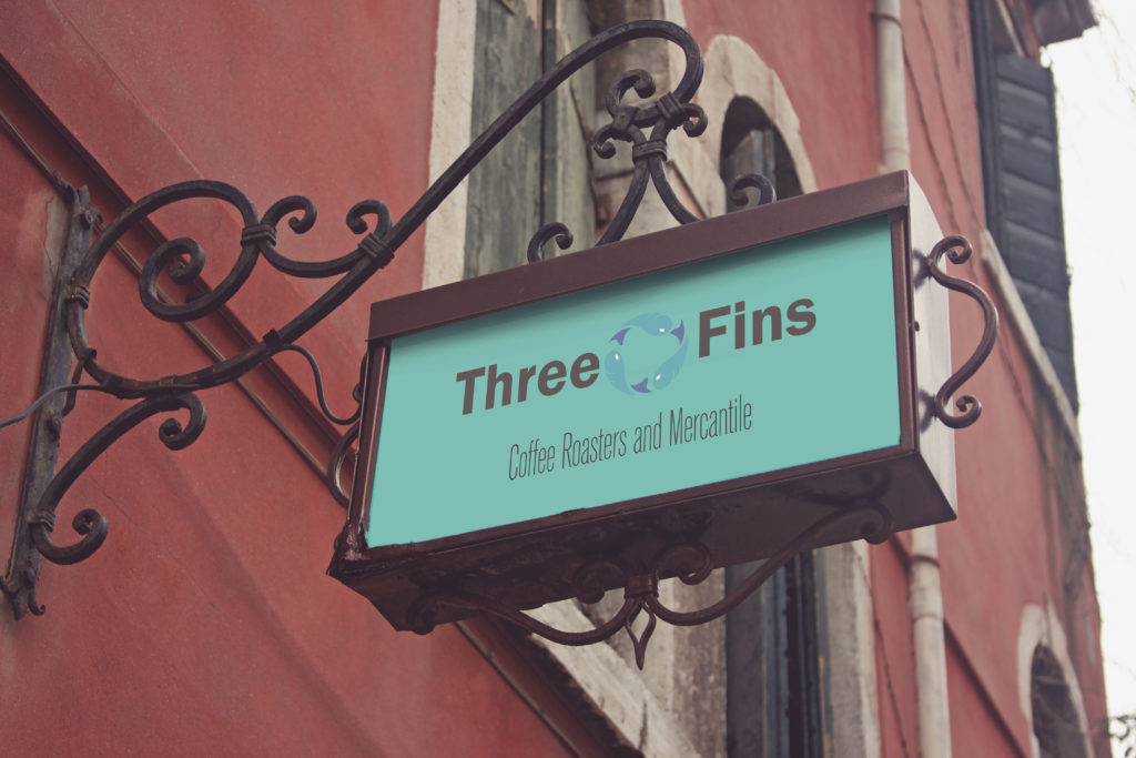
Sketch Progress
As I worked on this re-brand, I had some problems with using color, or which font I should have picked and where I wanted the fish to be placed. There were times where I wanted the fish to be under the word “Three Fins”, but I ended with having the fish in between them. I ended up deciding on having the fish be in between the words to make it more symmetrical with the wording on the bottom.
Three Fins Merchandise and Goods
As I finished creating the logo, I had done a couple of mock-ups of the logo on cups, a coffee box, a rewards card, and a t-shirt. On the rewards card, I wanted to keep the Three Fins look and use it to promote returning to their store for more coffee. All of these products would be sold in their store along with the great Three Fins Coffee.


Three Fins UI/UX
I had also created a Journey Board and a Mobile website. On the Journey Board, I focused more on having the “Events” tab more expressed to show off what Three Fins will work on. On their official social media, they put a lot of photos of their events but don’t do anything on their website. Having an Event page be above the fold will allow more people to go to their shop and events.


Final Result
Now that I finished this re-brand of Three Fins, I have learned a lot. I enjoyed creating a new identity for a company such as theirs with their passion to make the earth greener. I believe that with this re-brand they would appeal more to the tourist and produce more income. They would stand out more compared to their competitors and create more connections with the people and the environment. Check out another rebrand I had done here https://camilocreates.com/double-cola/. If you would like your own rebrand, contact me via my email creativecamilo@gmail.com and let’s get started.