
Double Cola
Double Cola is a soda company that has been around since 1922. They have created drinks such as Marvel Cola, Double-Cola, and Double Dry Ginger Ale. They were named “Double Cola” because, at the time, the average amount of soda was 6 ounces while they had 12-ounce bottles. They continued to perfect the Double Cola formula while also creating more drinks such as: Ski, Jumbo, and Minoku. Read more about their company here https://www.doublecolacompany.com/
Sketches and Ideas
My sketches and ideas came from the time Double Cola was created. They started off when soda was only five cents and when they were popular. Since I knew where I wanted to start from, I played around with the placement of the words “Double” and “Cola”. They also had a crown in their older logo which is something I brought into consideration and enjoyed using in this logo. I had still created other sketches to see if there was any other idea that came into my mind while creating this, but I enjoyed the coin the best because it connected it back to when they first began.


Producing the work
As I continued creating this logo, I came to a problem when creating the 3D coin. I didn’t know how the coin should have looked when it was tilting. Sometimes it looked too tilted away while other times it didn’t look tilted enough towards the audience. I also didn’t know how I would want to work on the coin itself to look. The hardest part were the ridges on the coin and how to portray them. It was tough debating about how many ridges were too much or too little. The C also has a vertical line in it to represent how far back the Double Cola company goes. I also had added the crown because on their old bottles and logo they had a crown-shaped object.

Colors and Fonts
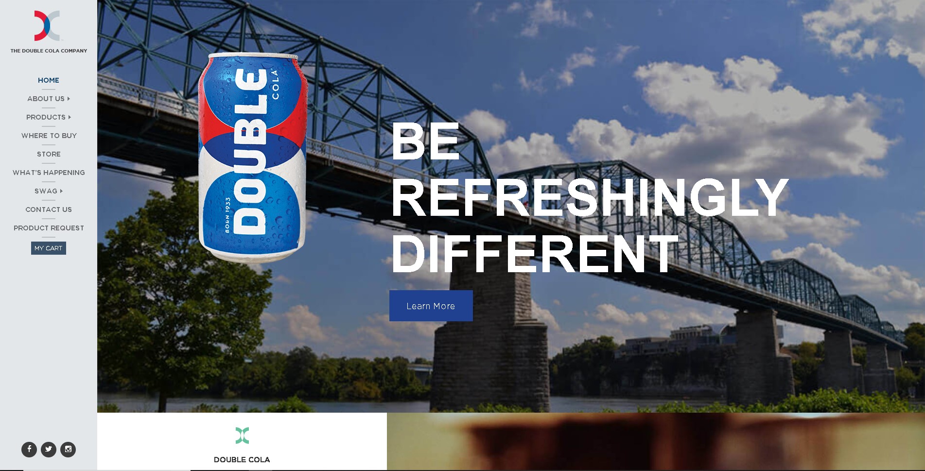
The colors I chose were a simple red, blue, yellow, and gray. I picked these because, on their own website, they already have these colors on their current Double-Cola soda can. I didn’t want to stray too far from the original colors because these colors have been there from the very start. The font I chose for the word “Double” was Pattaya, because of how elegant it looked. I went with the elegant look because of how I added the crown from before. The word “Cola” is in Lucida Console. This was the best because of how slim compared to Pattaya the lines are and how the letters form.
Double Cola Cans
Here I had done a rebrand for some of their flavors aswell! I had taken two of their


Double Cola Rebrand Conclusion
Finally, here I had completed the rebrand for Double Cola. I enjoyed being able to improve on the look for them to make them stand out more compared to other small named brands. Read more about other rebrands I had done with Three Fins Coffee https://camilocreates.com/three-fins-rebrand. If you would like to have your own rebrand, contact me via my email creativecamilo@gmail.com and let’s get started